
Daydream • 2026
Developing Daydream’s iOS App
Daydream is a fashion platform that enables people to chat with an agent to find and shop for products online. I led the iOS app as the sole designer to figure out what shopping with an agent should feel like on a phone. We went from kickoff to launch in four months, July to November 2025. Apple later featured it at WWDC’s keynote address. To understand more about Daydream, visit the site.
What we launched with: the chat sheet
The iOS app became a surface where we really leaned into native capabilities. I designed the chat sheet: a dynamic sheet that represents the agent itself. The sheet changes states where relevant in a customer’s shopping journey, creating a ubiquitous agent shopping experience.
Lightweight engagement features
With native, I also turned core features into lightweight actions. Web users were showing signs of “chat fatigue,” which created an opportunity to refine results without starting another conversation. Screenshotting with Apple Intelligence, long press, and pivots were among the interactions we launched in 1.0.
start with a screenshot
start a chat with a pivot
start a chat from a product
Collections that build themselves
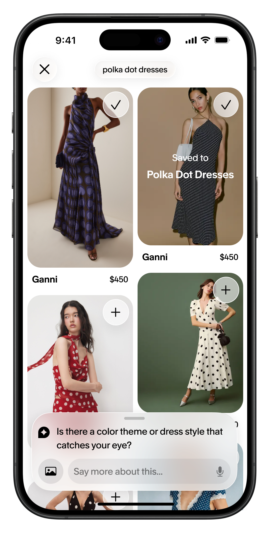
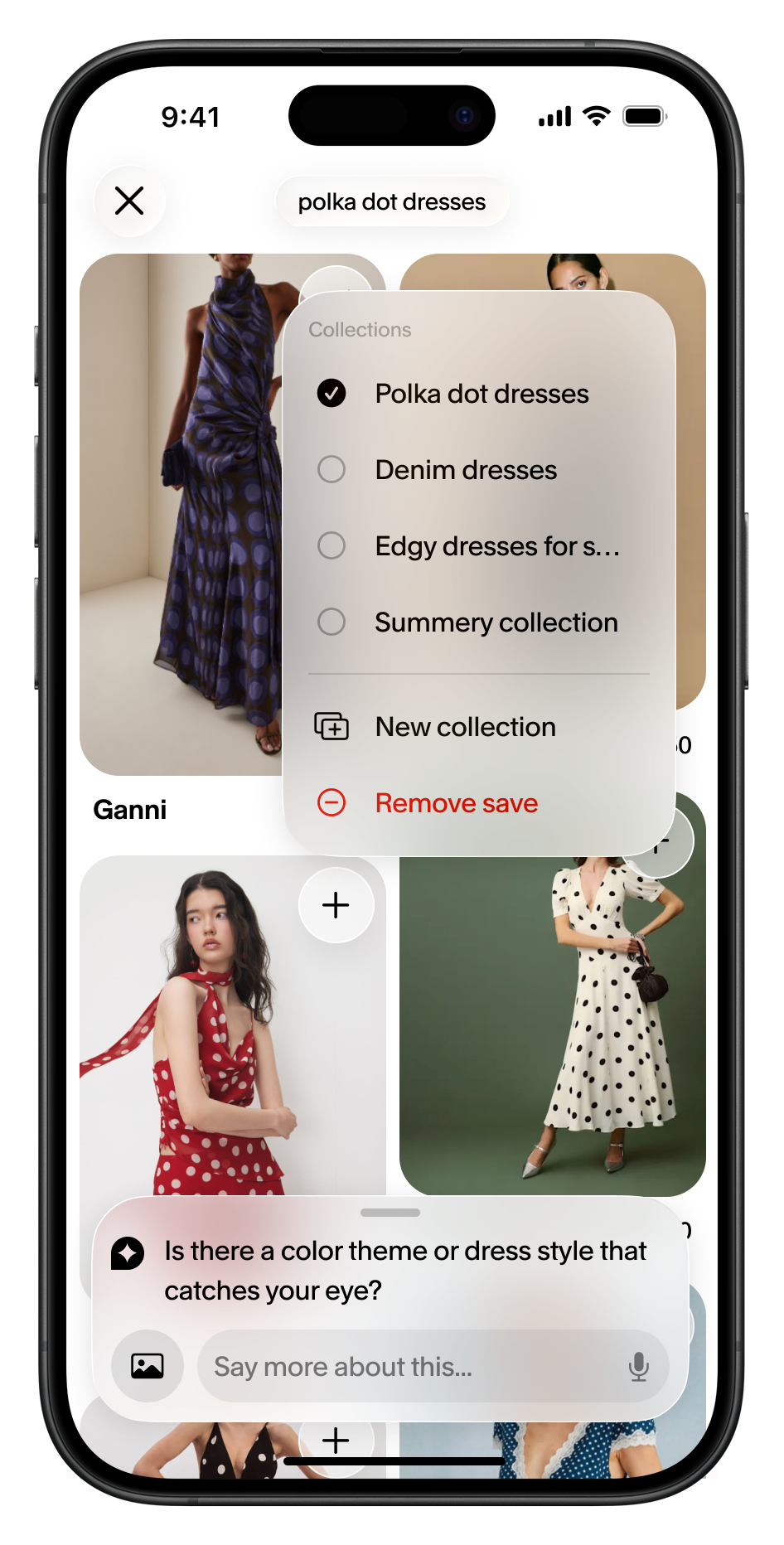
Saving to a collection was one of the strongest signals the agent had. But making collections by hand is a chore, so Daydream used Apple’s on-device LLM to sort every saved item into a collection automatically. “More like this” on a collection (say, “polka dot dresses”) drove the highest engagement, and more saves fed more recommendations. The next problem was discovery, so we explored slightly different transitions and placements to encourage it.
The developmental process
A big goal for the native app was an experience where the agent felt ubiquitous: appropriately present for a shopper’s whole journey, not like a chat window you open and close. So when I started on iOS, the big question was the right emphasis for the agent. Is it a sophisticated search experience? A new message you compose? A temporary session? Note: I built these videos in Claude / Xcode.
chat toolbar design
3 tab bars
grid to stack transition
After exploring several approaches, the chat sheet won for two reasons. It aligned with the web experience, keeping browsing as the primary surface with the agent layered on top. It also gave us a clear metaphor: the sheet was the agent, expanding, shrinking, and adapting to the conversation using native iOS behaviors.
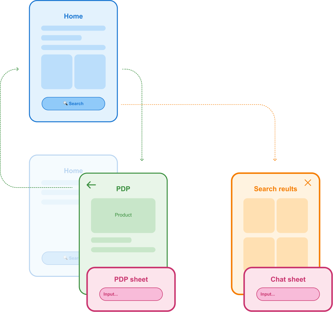
Replacing the tab bar meant rethinking the app’s navigation entirely. My team and I designed a “navless” architecture that kept the agent accessible everywhere while allowing people to browse and explore freely.
 Level 1Level 2
Shipping in four months
Finally, with the core agent experience settled, I built out the rest of the feature set in the navigation structure we’d aligned on. We had four months to take it from zero to one, which isn’t long. So I was ruthless about priorities, and built everything else, from onboarding to settings, around features that already worked on web.
Post-launch iteration & learning
For most of Daydream’s mobile life, the hard part was balance: talking to an agent versus scrolling a product grid. Here’s how that balance shifted on iOS.
Chat sheet
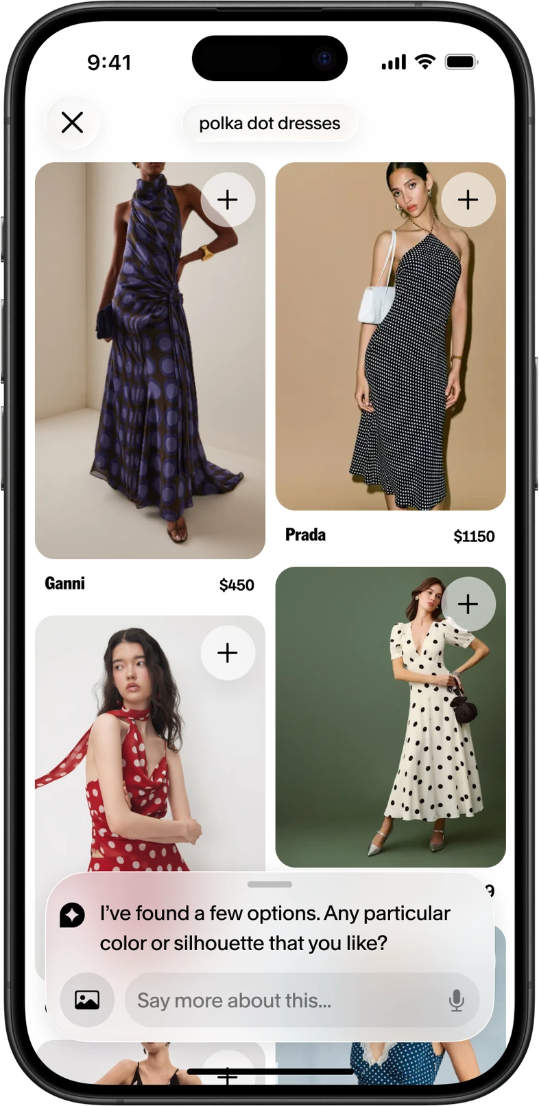
Post-launch, the chat sheet had one major flaw: navigating between different results was confusing. Because of the limits of the navless approach, going back to a previous product grid meant tapping the thumbnail stack in the chat, which wasn’t intuitive, and customers got lost within a search.
Shared plane
By then, people knew AI tools well enough that we didn’t need a separate layer to say “you can talk to this.” So we dropped it. The agent’s response and the product grid moved onto the same plane, and there was nothing to switch between.
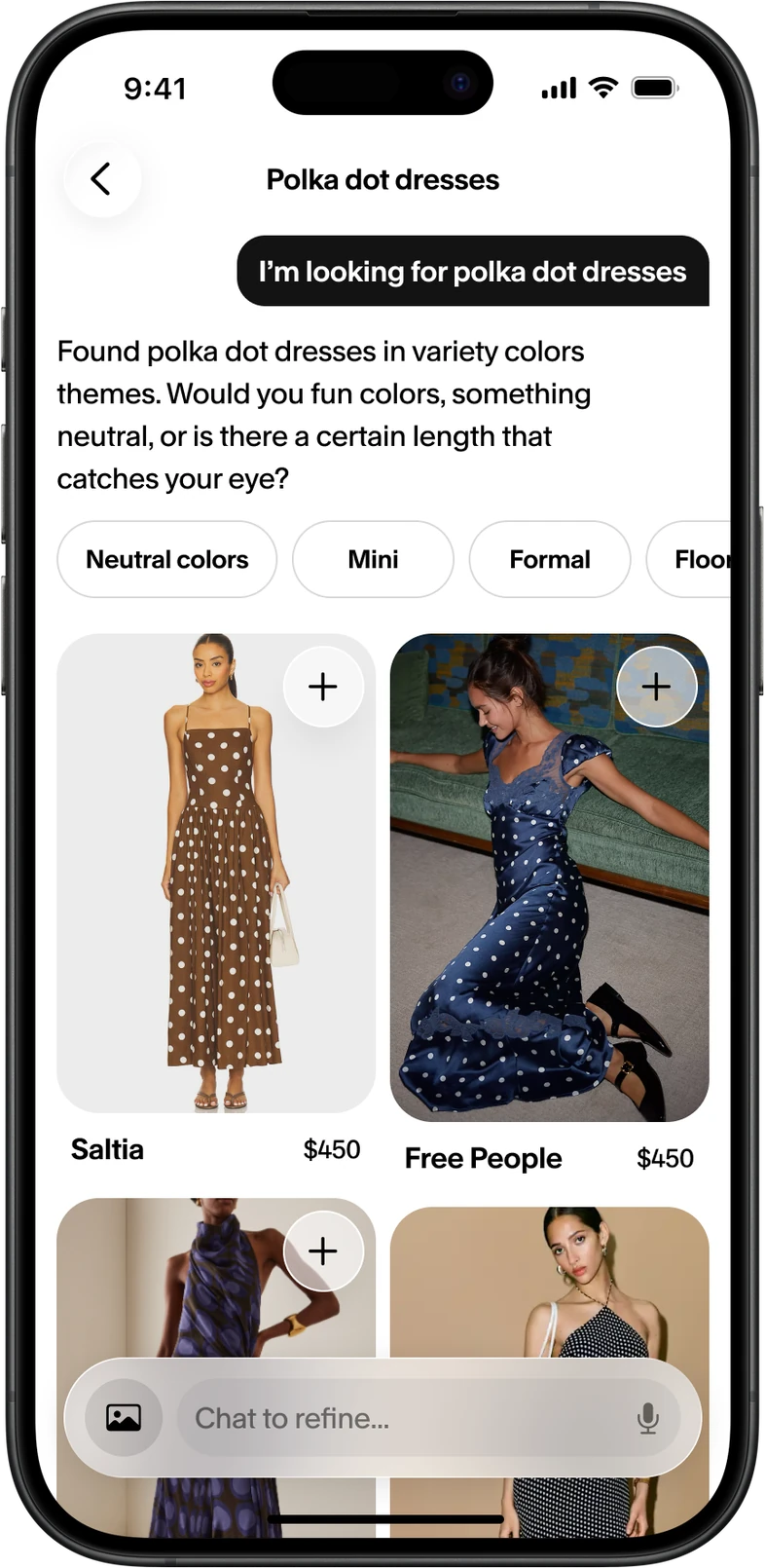
Unified worksheet
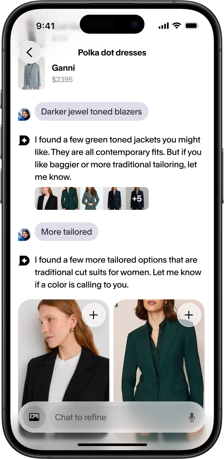
Then more people started searching without chatting at all: quick actions, images, product pages from the home feed. The conversation mattered even less. The worksheet flipped it around and made product pages the main way to refine.
Mobile web went through the same arc, just earlier. It started with an inline chat, moved to a chat sheet, added refinements, and landed on the same shared plane.
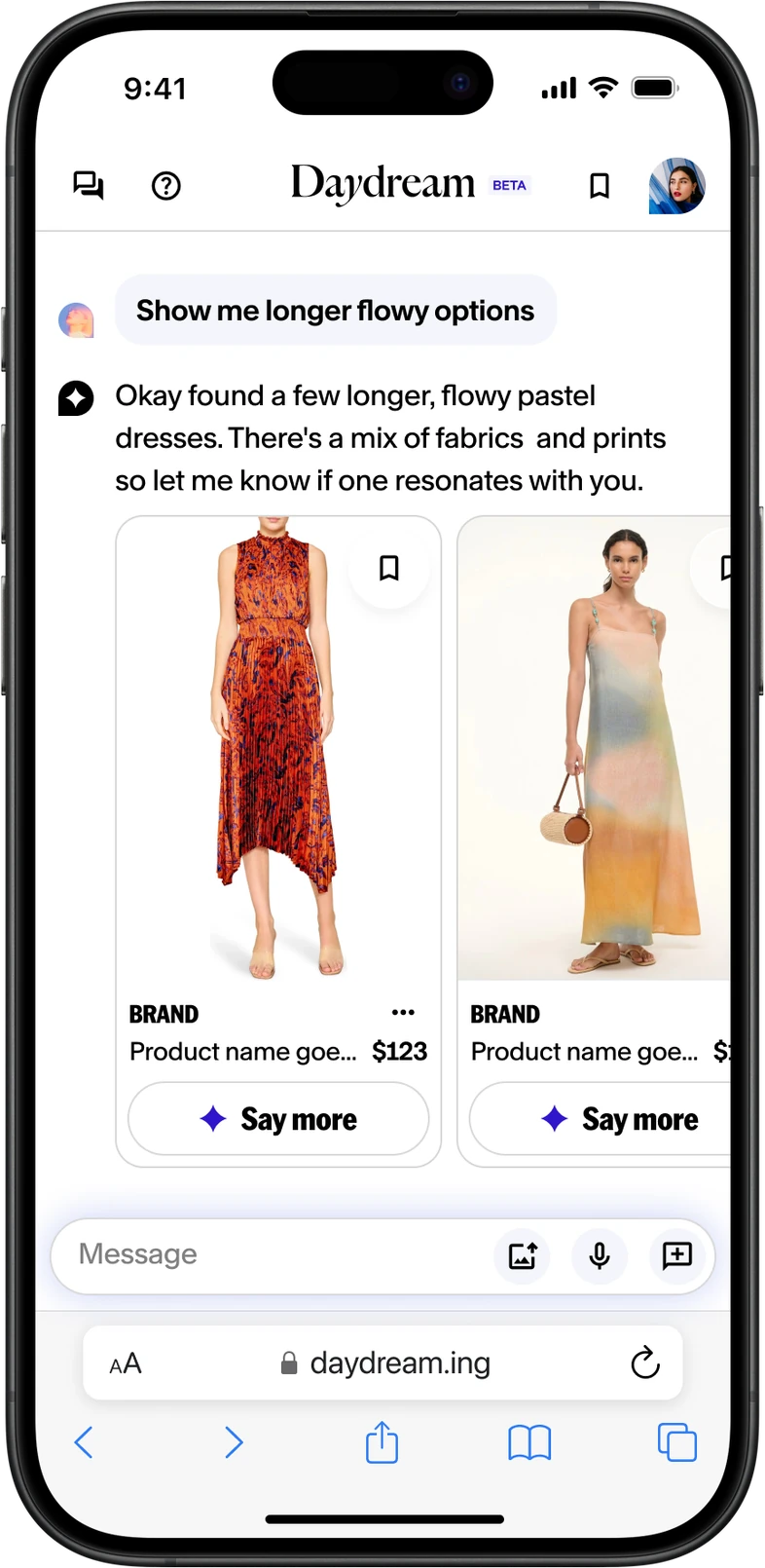
mobile inline
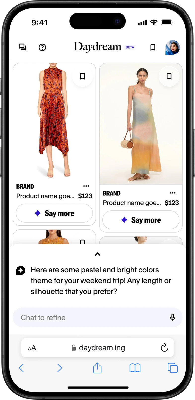
chat sheet
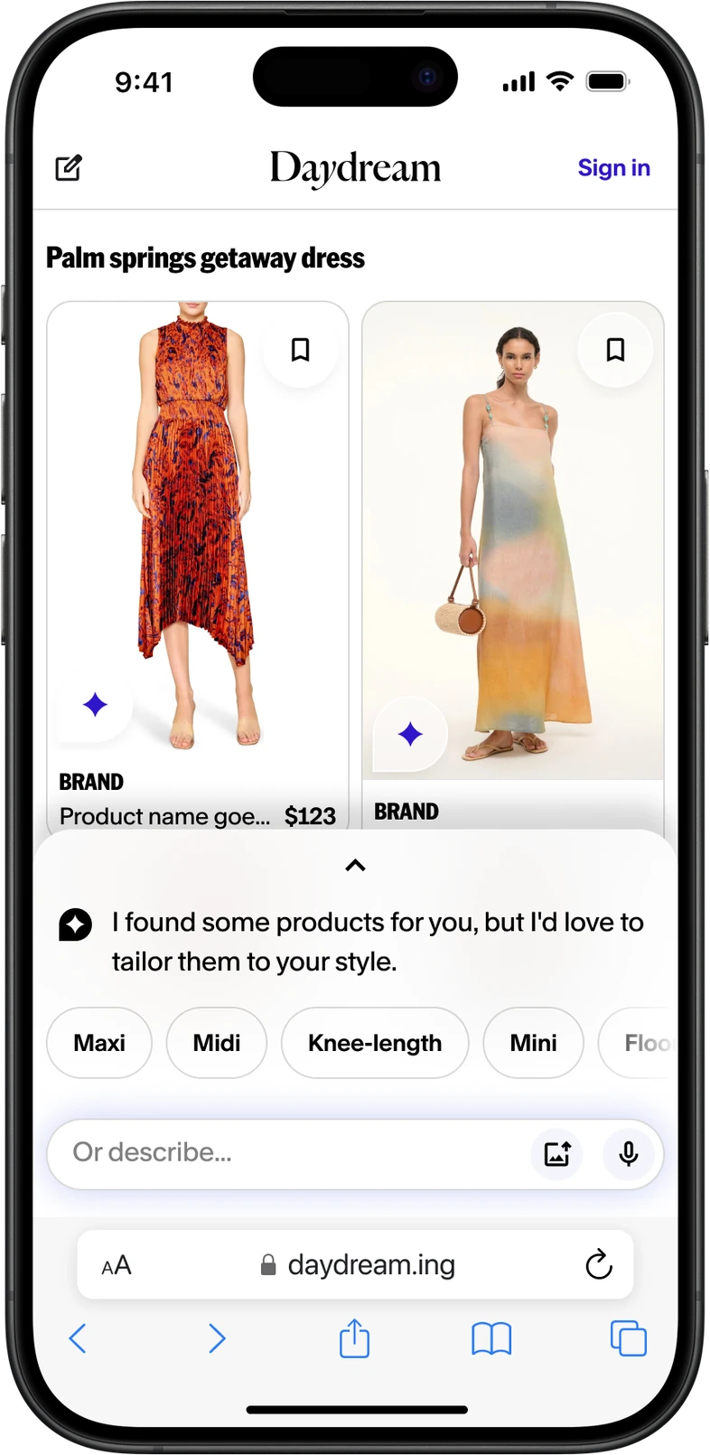
chat sheet + refinements
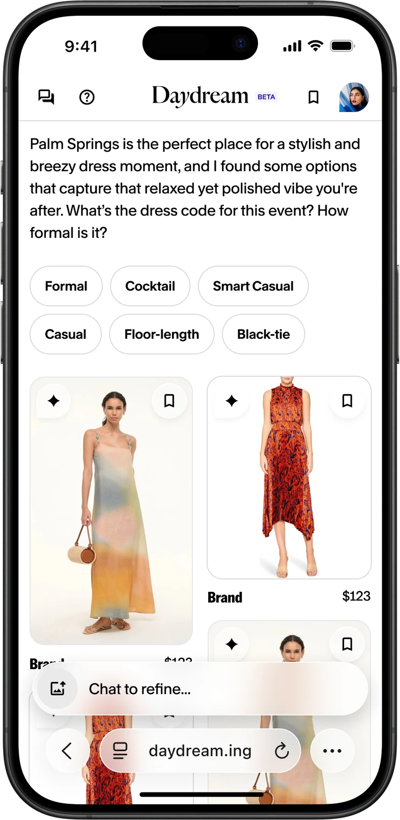
shared plane
Featured at WWDC
I got a chance to work with Apple through parts of this project, starting with a Liquid Glass workshop. The relationship with Apple grew as we incorporated their on-device model and the newly announced Apple Intelligence features, which eventually led to Daydream’s app being featured in this year’s WWDC keynote presentation!
Customer chat fatigue?
More and more, I noticed customers starting chats and refining without typing to the agent themselves. Image search, suggested chats, and refinement chips kept outperforming typing. Were customers experiencing chat fatigue? I started exploring a different metaphor: instead of a conversation, the product grid becomes a canvas. Customers use tools and knobs to manipulate it and refine their results, and save chat for the cherry-on-top detail right before they buy.