
Squarespace • 2020
Managing your Squarespace site away from your desk
I joined Squarespace at the start of 2020 to be a part of the Mobile App team. At the time (pre-COVID), Squarespace was seeing a rise in customers using Squarespace on their devices, which was a new development for a predominantly desktop-led product. I was brought on to help redesign their mobile app experiences to meet this change in demand.
Understanding mobile customers
With a little help from my HCI background, I got the chance to spearhead a user research study around people who used Squarespace both on web & mobile. This cohort (Desktop & Web) had a pattern that I discovered was fairly consistent. Much of the initial setup was done on the desktop. What they wanted from the app was the repeat actions for keeping up their site, things like updating a product or getting a blog post out. They generally wanted to be notified about their site’s performance.
Writing shouldn’t need a site editor
Blogging was the clearest case to tackle first. Many users wrote on the go and had photos they wanted to add from their camera roll. But writing a post meant opening the whole site’s editor, which included tools for styling and formatting. That’s a lot of machinery for a blog post, which the template already formats for you. I created Focus Mode, a writing mode that works like the Notes app. You write plain text. When you preview it, it comes out in your site’s style. From there you can save a draft, schedule it, or publish.
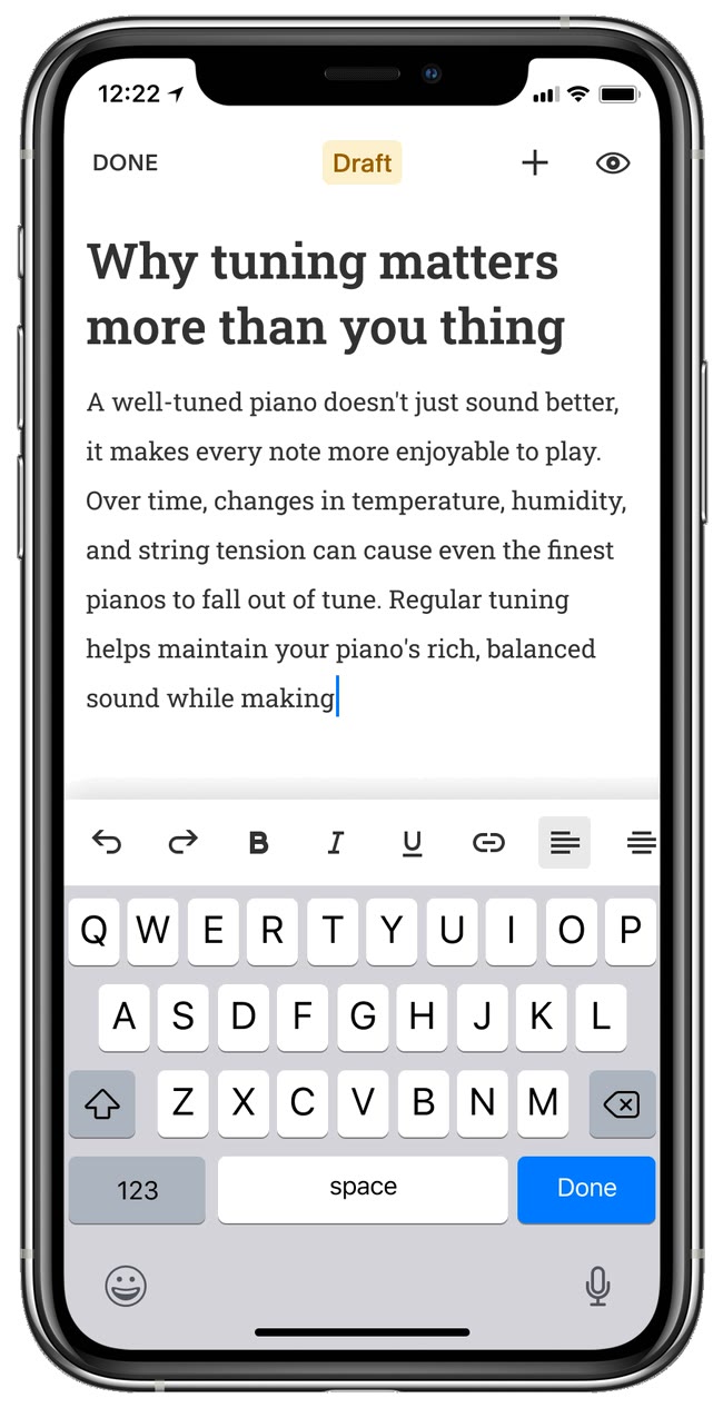
focus mode
Editing in sections
For editing the site itself, app users cared about big changes first, more than fine control. So I made editing the site section-based. Tap a section and an action bar comes up to add, reorder, or delete it. Tap it again to edit what’s inside: the text, the image, the button. This cell structure broke down the editing complexity into hierarchical steps, which made it more manageable on smaller screens.
Re-order sections
Edit contents inside a section
Edit Header
Dynamic sections were being built out company-wide at Squarespace. This supported what we called the “Template Store” – a place where a user can select from a whole suite of section formats based on their site’s style. I tapped into this by exploring what adding one of these dynamic sections to your site could look like on the app.
Re-ordering
Section store
zoom out
Three apps doing one job
When I joined, Squarespace actually had three separate mobile apps: one for Commerce, one for Analytics, and a general Squarespace app for editing. Each did a slice of the job, and they were eating into each other’s usage.
One app, separate surfaces
Now that we had a sense of what customers wanted from the app, it was time to merge the three separate apps together. Together with my mentor Andrej A, we worked on figuring out the right information architecture of the app so we could join the 3 apps into one. The goal was to keep the utilities somewhat separate so that customers who only cared about analytics could do so, while customers who cared about the spread could also do so.
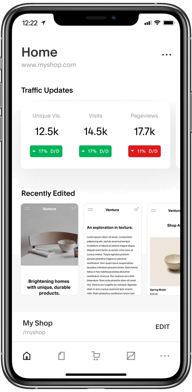
home
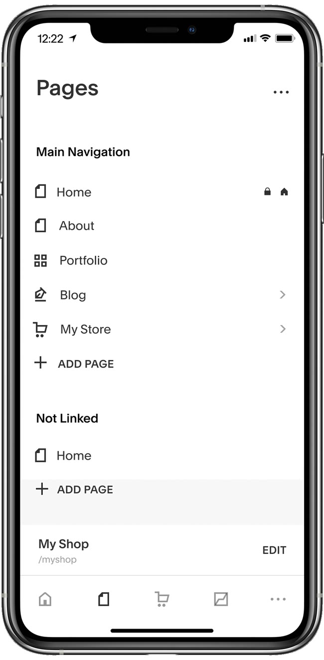
pages
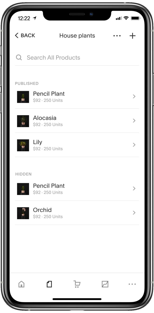
a collection
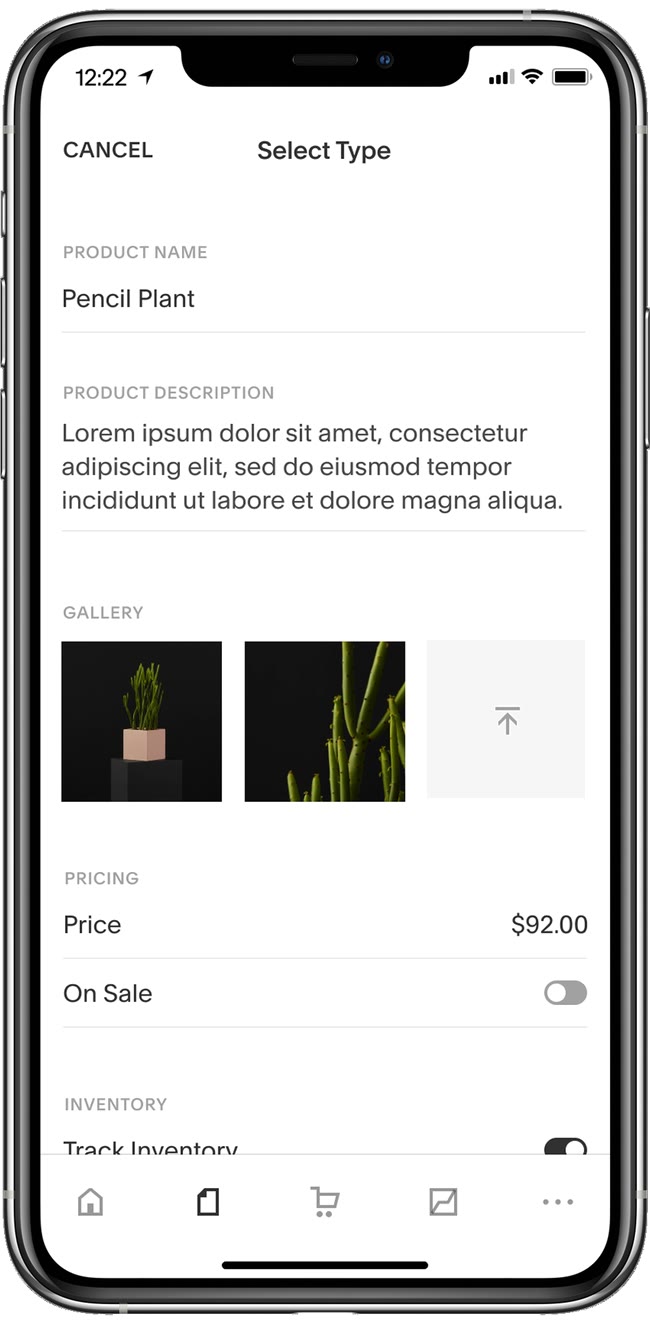
editing a product
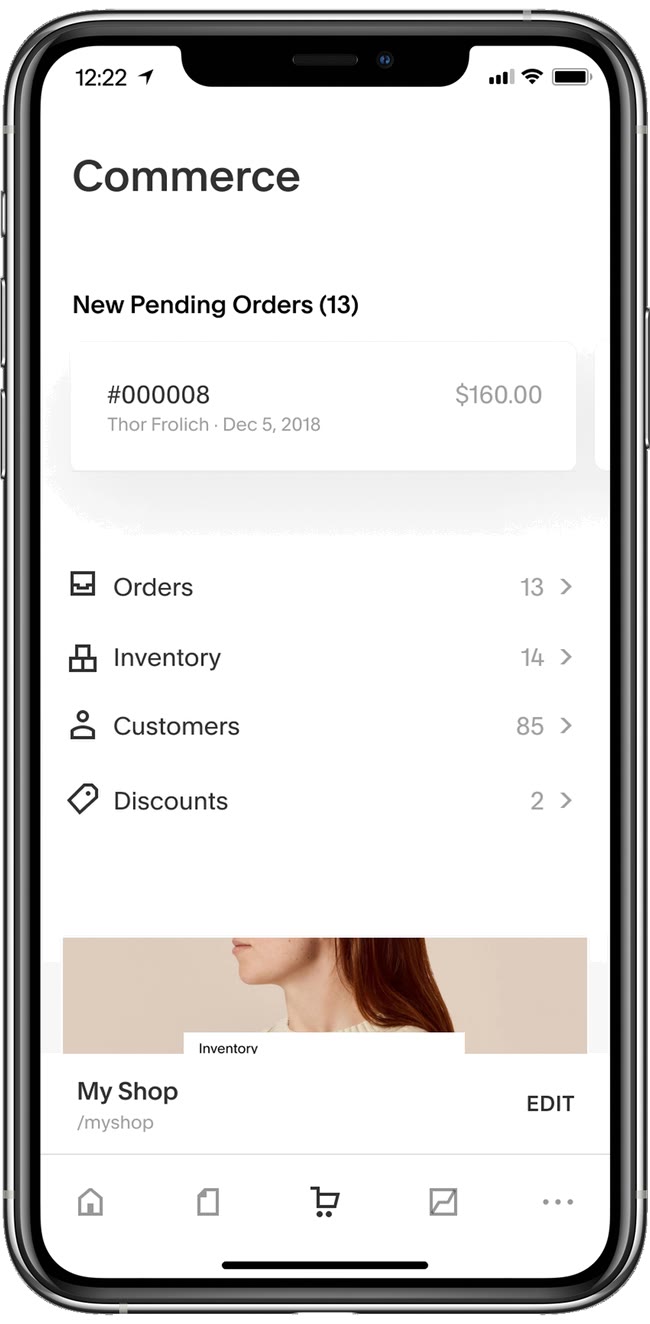
commerce
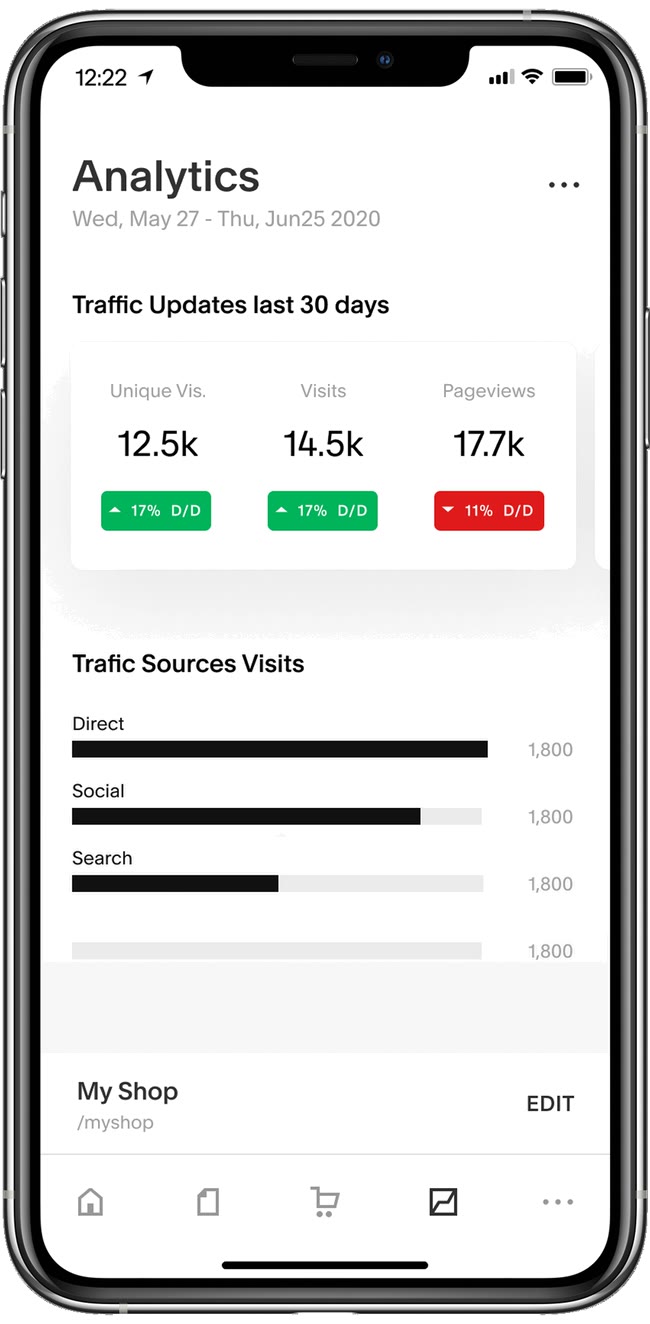
analytics
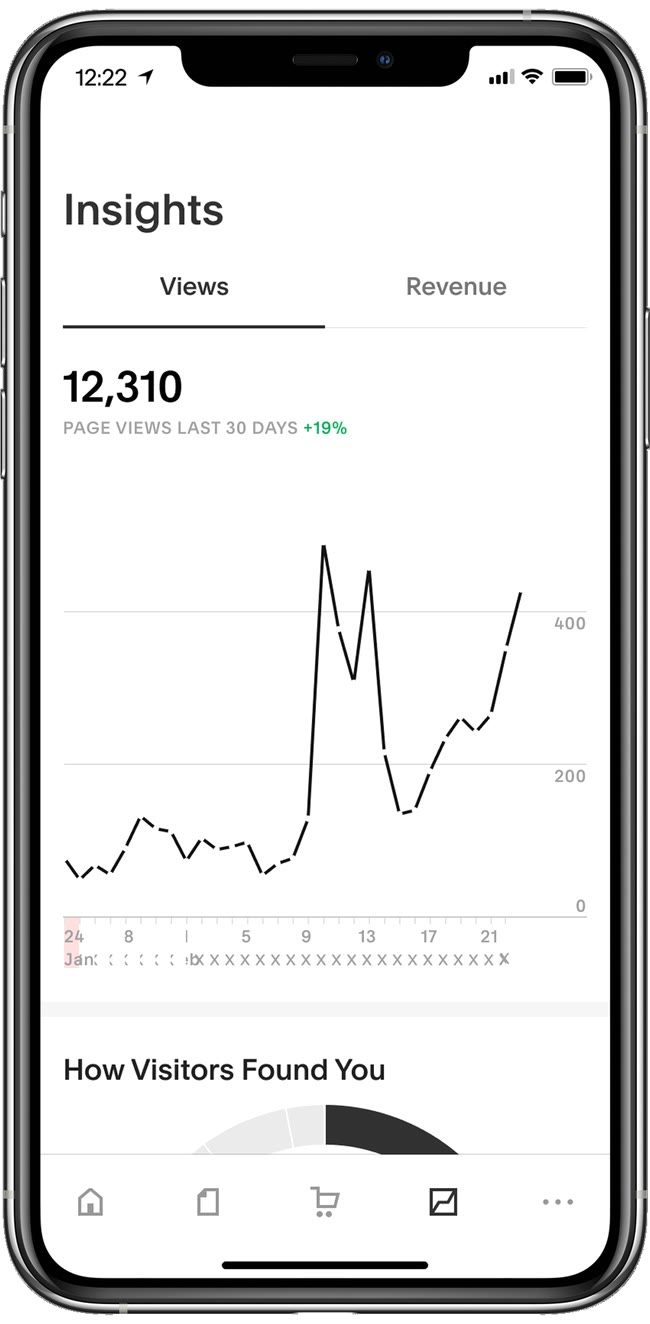
insights
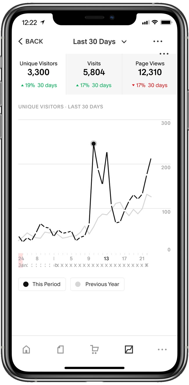
last 30 days
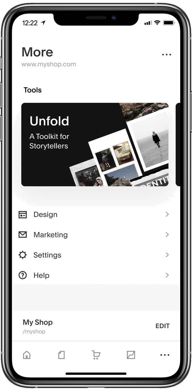
more
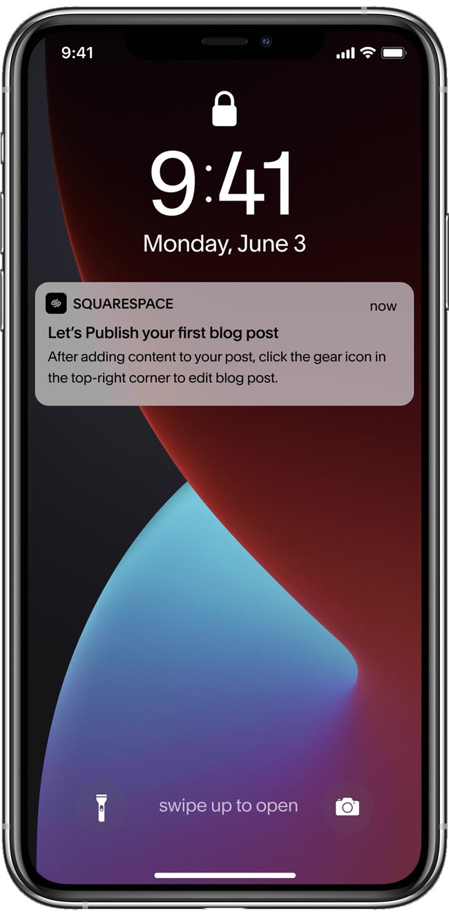
notifications
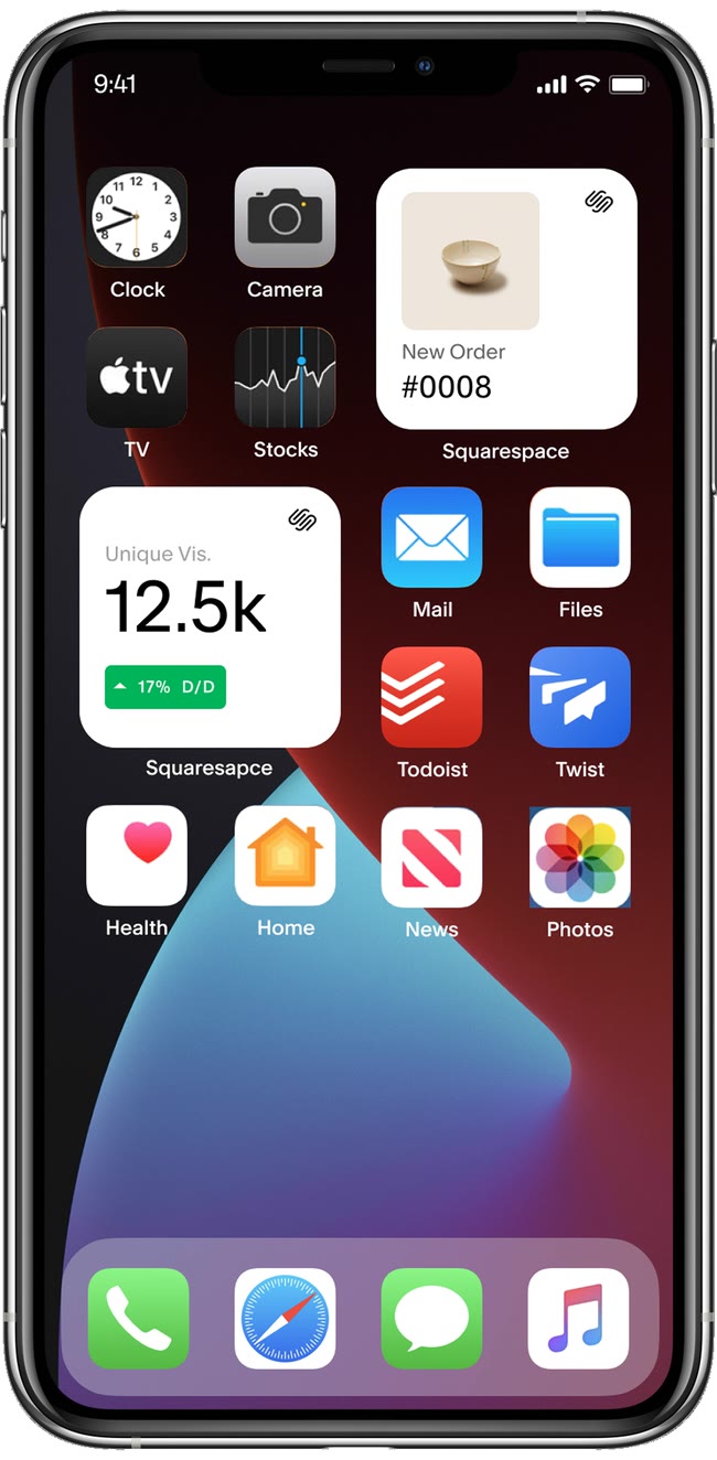
home screen widgets
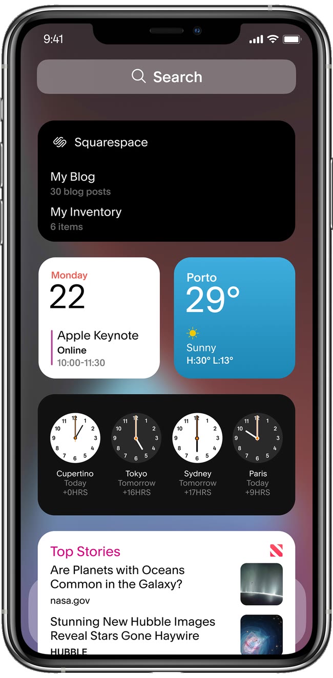
today view